


Overview
Commision
We were approached by Montréal incubator TandemLaunch to help one of their startups develop its product, rename the startup, and give it a visual identity. We had a great time collaborating with fantastic partners.
Client
Based in Montréal, TandemLaunch scouts, accelerates, and commercializes early-stage technologies from the world's top universities in close partnership with major Consumer Electronic brands.
Scope
Market Research
Value + Application
Naming + Visual Identity
Physical Product Design
Strategy
Startup accelerator TandemLaunch approached Detraform to direct product design and branding for their smart home enterprise named Smartiphy. Smartiphy was repositioning from a B2B licensing model, to a consumer electronics brand. We began by questioning everything, while evaluating Smartiphy’s goals and market position, ultimately deciding to rethink the entire brand identity.
Our first step was to learn everything we could about Smartiphy’s work, then we created a budget to address the highest priority creative elements.
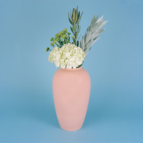
We worked to define to what Smartiphy believes in and how that would be expressed through our creative work. We moved away from a focus on technology, to a focus on the idea of home, comfort and style. With a seven week schedule we worked fast to prepare Aerial for a public launch at CES 2016.
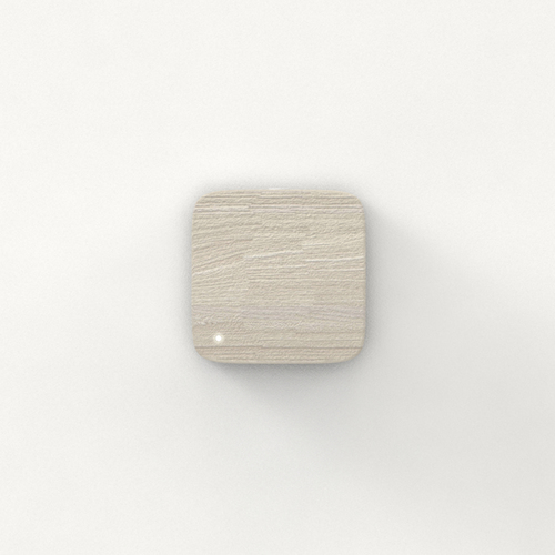
Product Design
We teamed up again with our friends at Kiwi & Pom to design a discreet smart hub that would elevate the technology, presenting a stylish product addition to any home. Kiwi & Pom brought polish and personality to five, fully rendered, design concepts.

Business name

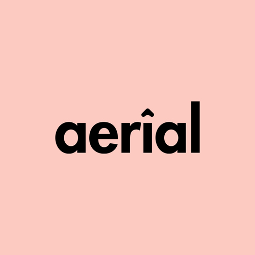
In the meantime we suggested the Smartiphy name was too startup-y and too industry specific. Starting with the idea of home, we went a vision quest to find the perfect name.
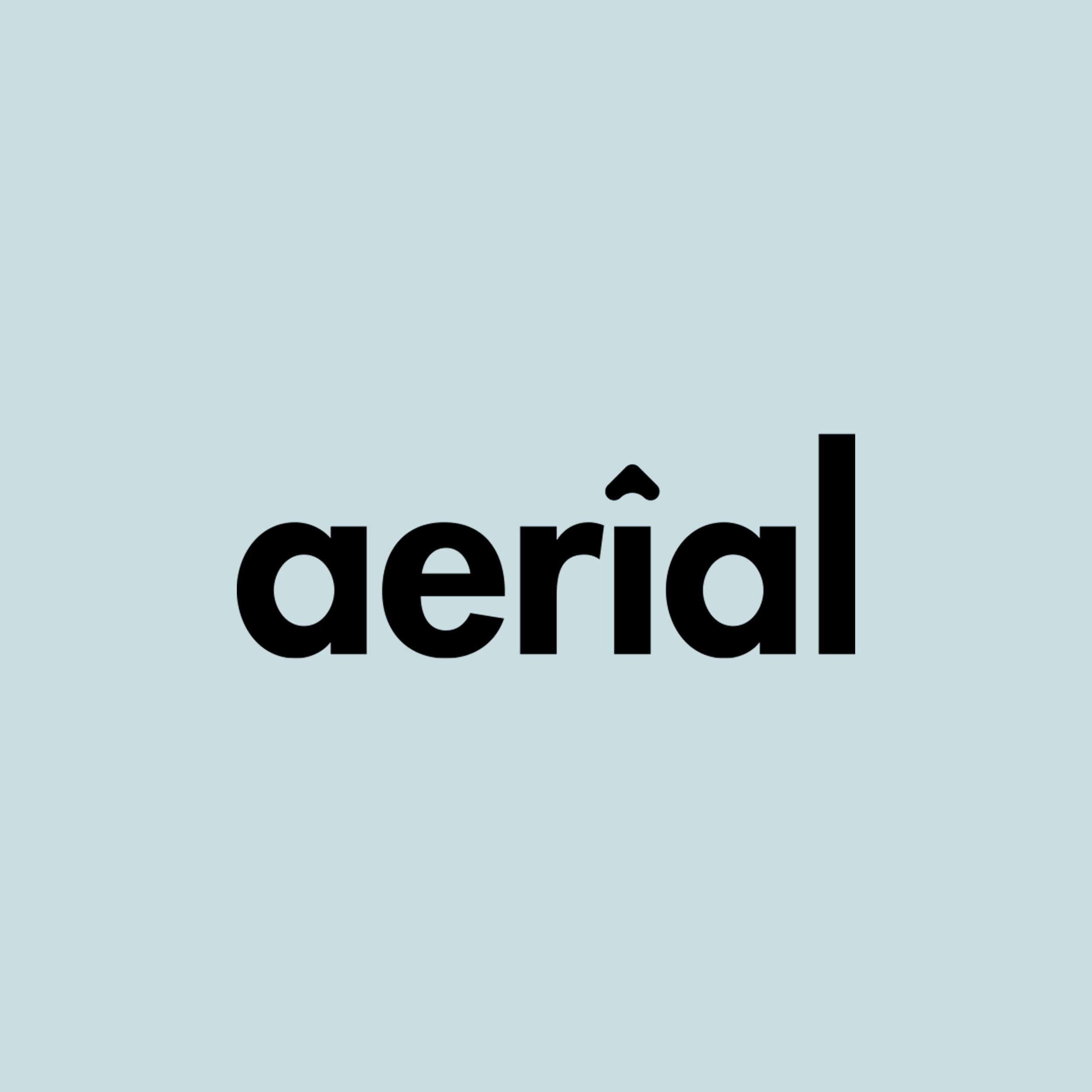
After a series of word maps, a notebook full of names, and some spirited debate at Smartiphy HQ, we finally settled on a new name that included connotations of air, communication, and a hint of femininity, a name we could weave a story around and that the company could grow with: Aerial

Logotype
Detraform’s concept was to create a logo that appeared only in black or in white, while the brand colours would be stylish, on trend and adaptable. In the future, if these colours grow tired, they can be updated without altering the logotype.
We presented three logos that are clean, strong and hopefully lasting. The selected logo includes a symbol combining the three metaphors of a roof, the letter a, and an upward arrow. But whatever, it either looks polished or it doesn’t.

fig. 04logos concepts
Visual identity
Finally, we put everything together into a visual identity that included the new logo, along with fonts, patterns, graphics, colours, copywriting tone, and stationery, all designed to present Aerial as more of a homeware brand than a tech startup. The branding was developed to have a warm, classy and feminine personality.
This brand ID completes a foundation that future creative content and marketing can build upon.
Introducing Aerial
⌄


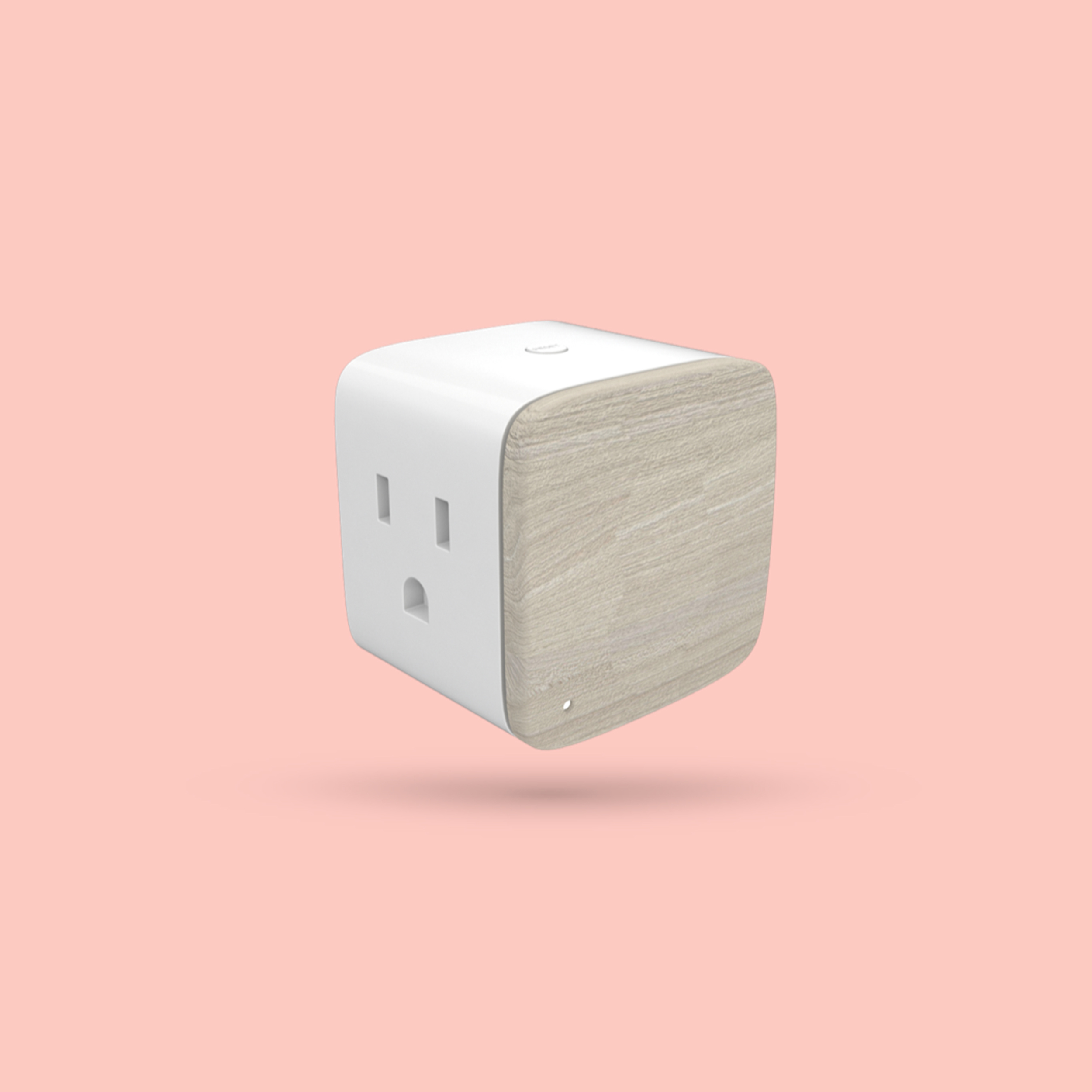

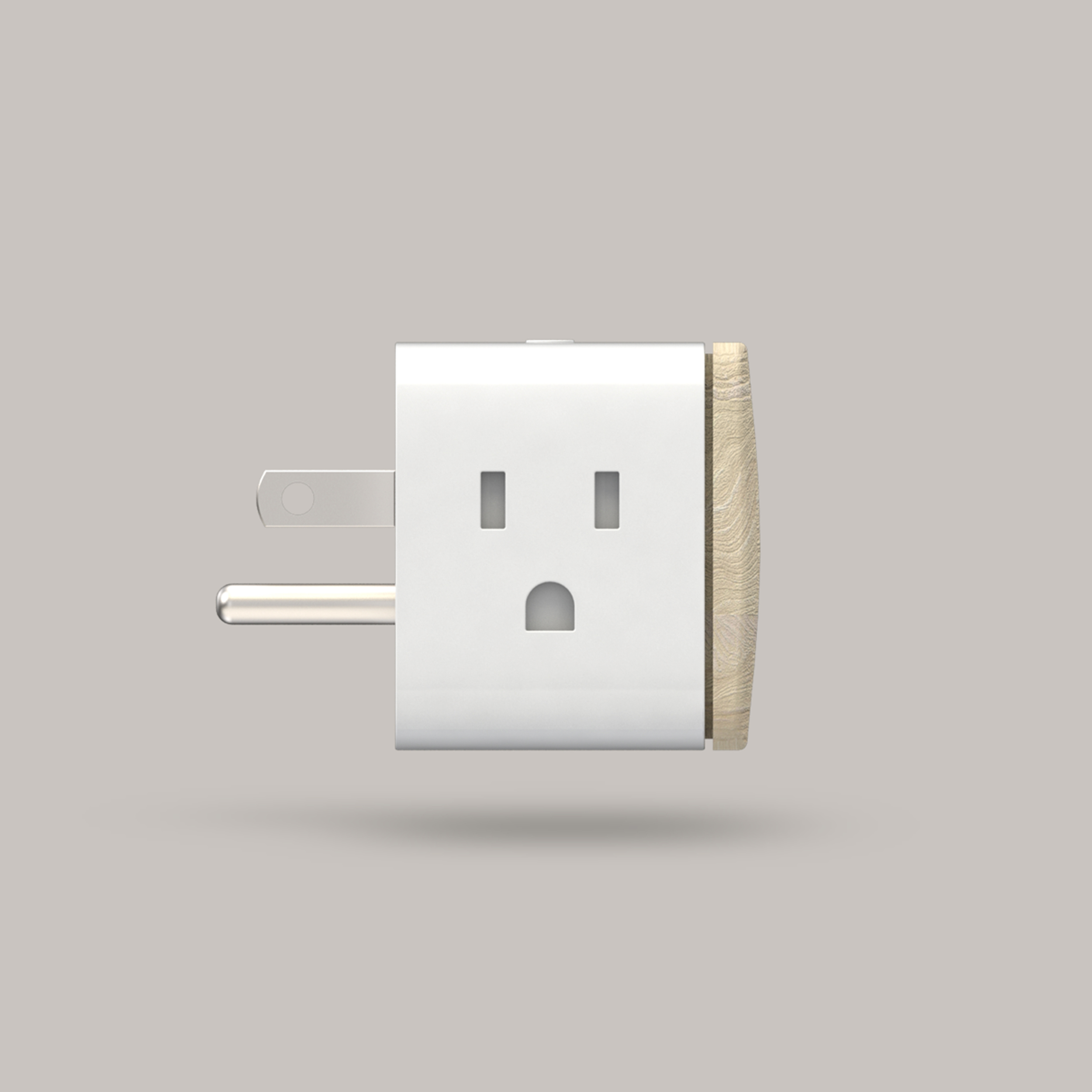


Aerial is developing smart home infrastructure that uses your home WiFi for discreet tracking. The Aerial nervous system generates real-time analytics with a network that is passive, and wearable free. Invite Aerial into your home for greater efficiency, coziness and shelter. Stay Tuned.

Press
The Wall Street Journal. "New Tech for the Home, Office and… Factory."

ILLUSTRATION: TODD DETWILER for WSJ
Photography courtesy of Elise Victoria Louise Windsor


